

Friday, November 25, 2016
Digital Abstracts
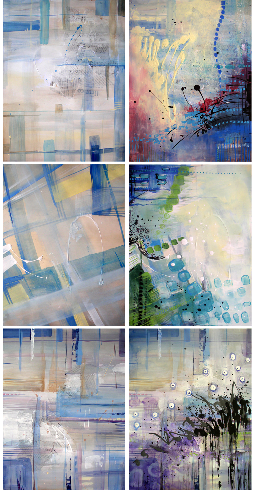
I found a new passion towards digital painting, and all thanks to a program called ArtRage and its tools that give it that same traditional feeling that I enjoy.
 Prints are available on RedBubble!

Monday, August 22, 2016

Saturday, July 30, 2016
Summer Art Sale on ETSY!

All must go so I can make some space to create new stuff :)

Sunday, June 28, 2015
Bird Practice - Acrylic Painting

I used the craft quality
acrylics because they are more opaque, more liquid, less glossy and I
find them easier to work with.
I started with the
background and it wasn't too hard to get smooth blending effect, but
it had to be done quick while the paint is still wet.
I enjoyed working on the
bird itself but I couldn't get the feather detail that I wanted
because the painting is really small.
This painting was also
supposed to be photorealistic looking. As I said before (on the oil
painting post), I think it would be best to leave that look to the
actual photos, but it is rewarding to know I can create something
that looks so similar to a photo.
I prefer the acrylic
medium over other mediums because it dries fast and it's easy to
repaint and fix mistakes.
Time: 2 hours
Fun level: 8/10
Difficulty level: 8/10
Success level: 9/10
I liked that it didn't
take a lot of time and I got really used to painting fast, so the no
waiting time for it to dry is a plus in my book.
I was engaged with working
on this painting for the full 2 hours and I enjoyed that.
I gave it a high
difficulty score because for many people, the fast pace is a problem
and getting close to photorealism does require a lot of skill and
practice.
I gave myself a high score
because I really like the end result, subtracted 1 because the grey
feathers could look better.
Saturday, June 27, 2015
Bird Practice - Collage

Fun fun and more fun!
I found it very exciting
assembling a bunch of different colors and textures and patterns
together to make this image... I guess flipping through a clothing
magazine looking for the colors I wanted, added to the fun as well :)
There was a lot of mess to
clean up at the end though.
Time: 2 hours
Fun level: 9/10
Difficulty level: 4/10
Success level: 9/10
-1 point in fun for the
aftermath clean up.
It wasn't too hard to make
and I even did similar collages with my younger students and they
made wonderful pieces, even if the colors weren't matching too much
the reference image, overall it looked very interesting and
expressive.
I gave myself a high
success score because while it's not perfect, I really like how it
turned out.
Friday, June 26, 2015
Bird Practice - Colored Pencils Drawing

I have pretty cheap
colored pencils so it could look better with higher quality pencils.
I couldn't get the colors to be as bright as I wanted.
I personally didn't enjoy
this drawing as much, it's not a very forgiving medium, hard to
erase.
I enjoy mixing colors, and
with colored pencils it's better to pick the closest color pencil to
what you need because they don't blend as well as paint does.
Time: less than 2 hours.
Fun level: 5/10
Difficulty level: 7/10
Success level: 6/10
It wasn't one of my
favorite practice pieces, but I definitely didn't hate it. I found it
kind of tedious to look for that pencil that had the color I needed.
I rated the difficulty
level at pretty high because there is very little room for mistakes.
Overall I think I did an
okay job considering what I had to work with.
Thursday, June 25, 2015
Bird Practice - Watercolor Painting

I love watering down every
paint type that I use (make washes and glazes), but for some reason I
never became good friends with watercolors.
This was my 2nd
attempt for this practice because I made the first one on a different
kind of watercolor paper, lower quality I assume, and I didn't get
even close to the effect that I wanted.
So please note, the
quality of the paper is really important.
I wanted to keep it simple
looking and not do a lot of details.
Watercolors require a lot
of layers and some waiting time between each layer application.
Time: 1.5 hours
Fun level: 6/10
Difficulty level: 9/10
Success level: 5/10
It's a simple painting but
still had to wait for it to dry, I don't like waiting.
The painting part itself
is challenging which makes it pretty fun.
While this painting wasn't
difficult to make, I find that watercolors are the hardest medium to
master.
I did get it close looking
to the reference image, but I'm not really satisfied with it. I could
do better but that would require a lot more practice.
Wednesday, June 24, 2015
Bird Pactice - Pencil Drawing

Working on this piece,
made me remember just how much I loved drawing and realize how much I
missed it.
Overall it was a very fun
process that I really enjoyed.
Pencil drawings have this
almost instant satisfaction effect since as soon as you finish
working on a small area, like the eye or the beak for example, it's
already visible how good it looks, while as with most painting
techniques, that feeling only comes at the end.
So as I was adding each of
the feathers, it already looked good and kept getting better.
I made the background a
little more abstract looking because I just enjoyed it too much and
got carried away, in retrospect it would've been a lot better of a
practice to do the background a lot smoother and more similar looking
to the photo reference.
Time: Around 3 hours
Fun level: 9/10
Difficulty level: 5/10
Success level: 7/10
I would give it 10/10 in
fun, but I reduced a point because of the background, I assume that
if I had to make it better blended and realistic, it would take more
time and not as fun.
Difficulty level at 5
because I found it rather easy, once you get enough control over the
marks you can make, it becomes pretty simple. It was all done with
one simple mechanic 2B 0.7mm pencil.
I gave myself a pretty
high success score because I didn't smudge anything and I have loose
and free lines here and there that keep the drawing interesting
looking, I took 3 points away for the background.
Tuesday, June 23, 2015
Bird Practice - Oil Painting

I made this painting on
heavy paper. Oil paint gets absorbed into the paper and dries up
really fast, on canvas it dries a lot slower. I can't exactly say
what is better, paper or canvas, it depends on personal preference.
It being painted on paper
worked with me on some sections and against me on others. For example
it was pretty hard to get a smooth blend on the background because it
was drying fast and I had to keep reapplying paint. I found that it's
a lot easier to just add not really well mixed paint and then smooth
it up with the finger instead of a brush, that was fun! Who can say
no to finger painting, right?
On the bird itself, it was
to my advantage that it dried quickly. I made a thin layer of paint
as the under color and built up the smaller and thinner brush strokes
to get the light feathery effect.
It's a rather small
painting (5x6.5”/12x16 cm) so I couldn't get the amount of detail
work done that I wanted, at the end I was working with a brush that
has like 3 hairs and even that wasn't thin enough.
I was trying to make this
painting photo-realistic looking and I think I got close to it. I am
still against the photorealism paintings, because I could get a much
better picture if I just printed the reference image, it wouldn't be
as time consuming and I think it gives more value to the art of
photography.. but... seeing that I am able to create something like
it is rewarding.
Time: 3.5 hours
Fun level: 7/10
Difficulty level: 8/10
Success level: 8/10
The process wasn't as fun,
I didn't really enjoy how much I had to rework the background, but I
really enjoyed the way it looked at the end.
While oil is still one of
the more forgiving mediums, every mistake costs a lot of waiting
time. When paint is still wet, it's hard to cover it up without the
colors mixing, this painting being on paper did help but still took
time. Trying to remove the paint by adding more oil or mineral spirit
and wiping it off, put the rest of the painting at risk since the
painting is small.
I gave myself a high
success score because I think the end result looks pretty good.
Monday, June 22, 2015
Bird Practice

For those who know me, I
mainly do abstract work... And the figurative works from TooMuchColor
project are very stylized and somewhat abstract looking as well.
So I decided to challenge
myself and see what I can do with other styles and different mediums.
I documented my
impressions of every piece that I made so far and will be posting
them every day.
Saturday, May 3, 2014
Process

Have you ever started a painting with
the thought “where on earth am I going with it?”
Lately that has been part of every
painting I make. No finished image in mind, just dive into the
process without over thinking it.
So I made this little painting of 12x12" and recorded the process of creating it.

Thursday, December 26, 2013
Practice in Repetition
A few days ago I pushed
myself to paint as much as I can in one day. Something repetitive but
every time trying different color schemes and compositions.

Click for bigger view..
Doing something over and
over again is a great way to master the used technique or really
learn the subject matter.
One of the more famous
examples of repetition was Van Gogh's haystacks. He painted them in
different time of the day, different weathers, different seasons,
different compositions and slight change in styles.
For me it was interesting
to feel my imagination stretch, visualize what the end result might
be while just picking the colors, and of course sense of
accomplishment for doing so much in so little time.
I feel I'm getting better
at achieving the playfulness of the brush strokes that I want, and I
now have ideas that can be used for bigger pieces.
All these pieces
named Star Dusts, they are letter size (8.5x11” / 22x28 cm)
on thick paper, and are available for purchase for only 50 USD
(shipping included).
If you are interested, you can message
me here or on Facebook.
Happy Holidays! :)
Friday, October 25, 2013
Artistic Block
A couple of days ago I was asked “What
do you do when you're blocked? “ as one of the questions I had to
answer for the upcoming book "A World of Artist Journal Pages"
for which my art journal was chosen to be featured in.
It really got me thinking of what a
block is and analyze my reaction to it and the end results.
I must say, I gained a whole new
perspective on the matter!
It is important to note that this
approach won't be as effective for everyone.. but as a professional
artist, I just can't afford to sit doing nothing and dwell in it.
Keep in mind, there is a difference between artistic block and
a need to take a break for what ever reason.
Artistic block for me usually starts as
lack of desire to do anything.. then morphs into more of a hunger to
do something but not knowing what.. and ends with me doing something
interesting and new!
I came to the conclusion that it is a
very important part in artistic growth. It symbolizes the fact that
I'm bored with what I'm doing and that it's time to move on and open a new page.
Growth doesn't always come easy, just need to persevere.
Most of the time I just do what I want
to do.. and not that much of what I need to do - practice! The
trick is to take that moment of frustration and force yourself to do
something.. anything!
Waiting for the block to just go away,
sadly isn't that effective and it can take ages while your skills
slowly begin to rust.. You need to take control and get rid of it!
Here are a few things that you can do:
- Try new style
- Try new medium
- Try new tools
- Make lists of interesting things you want to try and when you are blocked, start checking those things off.
- Copy something that you like
- Think outside of the box – paint the music/sound/smell/weather..
- Take an art class – You'll have a personal commitment to do the assignments and you'll be surrounded by other creative and inspirational artists.
Artistic block is natural and happens
to everyone, it is okay and by no means a reason to get stressed
over.
Monday, September 16, 2013
First Stage Frustration
I noticed many people go through a
frustrating confusion at the first stages of creating something.. No
matter what the subject matter is, there is always something that
isn't perfect.
But remember, good things don't come
easy! Stick around and see what it can grow into.
This is mostly true for artists that
work in a similar way like I do... I dive into the piece with no
clear direction to see what will happen. I love struggling through
the visuals till I get it all solved to the point that I find it
complete.
It might sound like a cliche, but my
paintings are a journey for me. I paint for the process of it, not so
much for the end result.
I have my moments when nothing works,
pushing through it sometimes makes it even worse... but unless I give
up, at the end it is all worth it.
Here is an example of my painting
“Oasis of Serenity” that is now displayed at UGM's Rotating
Gallery. My only clear direction was that I wanted to make something
both calm and uplifting.

1st photo was just to point out the
texture that I had to work with.
2nd photo is when I got the
feeling that I have no idea where I'm going with it.
3rd photo I found the color
that seems fitting and the rest went as smooth as butter.
4th photo is the end result.
My advice is not to treat your piece as
something precious, it is ok to fail. If you learned anything from it
– it was worth it. Mistakes can turn into something amazing!
It is hard at first, just don't ever
give up!
Wednesday, July 31, 2013
Let your work rest
We all have surge of
inspiration or just desire to create sometimes, many pieces are
created easily, without any problems or delays... but, some pieces
just don't work. At the point when we feel frustrated, it can be very
beneficial to just leave it alone for a while.
Few days ago I was going
through some of my old practice paintings that I've done about half a
year ago. It was easy to see how my style changed since then and I
got many ideas on how I can change them, make them better.
Even thought it looks
completely different, I did preserve some of the elements I liked in
the under layers.
Sometimes I also look at
my painting as I'm working on it, in my eyes it's not finished, but I
simply don't know what else can I do to it. I had few pieces that I
left for a while, and was working on them through out a long period
of time, a touch here, and a touch there... Now, those paintings
became my favorites.
When nothing works...
painting over it and reusing it is also a great idea!
Saturday, July 20, 2013
What being an artist is all about
Here is a very short summary of quotes from the letters of Reiner Maria Rilke to a young poet (1903):
Rainer Maria Rilke (1875 – 1926) was born in Czechoslovakia and died in Switzerland. Considered the greatest modern poet in the German language, Rilke counseled the young poet over a period of five years. No evidence exists that they ever met.
There might be things that we will disagree with, but to some extent, I feel that they are true. It's important to learn from others, but we need to be ourselves first, and what we create, needs to be our own.
I find it amazing that we can learn till this day so much from advices that were given more than a century ago.
Your work must be independent from others' work.
You must not compare yourself to others.
No one can help you. You can only help yourself.
Criticism leads to misunderstandings and defeatism.
Work from the necessity and your compulsion to do it.
Work on what you know and what you are sure you love.
Don't observe yourself too closely, just let it happen.
Don't let yourself be controlled by too much irony.
Live in and love the activity of your work.
Be free of thoughts of sin, guilt and misgiving.
Be touched by the beautiful anxiety of life.
Be patient with the unresolved in your heart.
Try to be in love with the questions themselves.
Love your solitude and try to sing with its pain.
Be gentle to all of those who stay behind.
Your inner self is worth your entire concentration.
Allow your art to make extraordinary demands on you.
Bear your sadness with greater trust than your joy.
Do not persecute yourself with how things are going.
It's good to be solitary, because solitude is difficult.
It's good to love, because love is difficult.
You are not a prisoner of anything or anyone.
Rainer Maria Rilke (1875 – 1926) was born in Czechoslovakia and died in Switzerland. Considered the greatest modern poet in the German language, Rilke counseled the young poet over a period of five years. No evidence exists that they ever met.
There might be things that we will disagree with, but to some extent, I feel that they are true. It's important to learn from others, but we need to be ourselves first, and what we create, needs to be our own.
I find it amazing that we can learn till this day so much from advices that were given more than a century ago.
Friday, May 3, 2013
Photographing Art Work
Taking a traditional painting and
trying to turn it into a well presented digital image can be tricky.
To get to the best representation there is a need to get a good photo
of it and do the right editorial work.
In this blog, I'll cover the
photography part.
Here are 2 examples (click to view):


Window – It's better to take photos
outside, but it was cold during the winter, so I took some photos of
my paintings near a window. The biggest problem is that there is a
gradient of light, lighter by the window, darker further away.
Shade – Taken outside in the shade. I
personally believe that is the closest to the original look of the
painting.
Sunlight – Direct sunlight fills the
painting with very bright colors, sometimes brighter than the actual
colors. If the painting has glossy areas, they will shiny. If there
is some texture in the painting, it will cast shadows.
Flash – A big no no. The focus of the
light usually in the center, darker around. Glossy areas pick up most
of the light and make the painting look as if it is covered in
plastic food wrap.
No flash – In rather dark place it
will be really hard to get the focus right, most of the times the
photos come out very blurry and with a slight color change.
Room light – Most of the room lights
have a touch of yellow in them, the yellow can be clearly seen in the
photo.
Additional tips:
- Take photos of your paintings before you varnish them, the gloss is very often hard to deal with.
- The best time of the day to take photos is around noon, the later it gets, the more yellow – orange the light becomes.
- Some paintings photograph better in direct sunlight (if there is no gloss or texture), but from my personal experience, the closest colors to my paintings, are in the photos taken in the shade.
- Take at least 3 photos, there is always a chance for something to go wrong. Look through all the photos and pick the best one.
- The easiest way to know that the light source is good enough is when your camera is set on auto (flash when needed, no flash when not needed) and it doesn't flash.
Your work deserves a good
representation!
I hope it helped..
Saturday, March 30, 2013
Can't Be Unseen
Our mind is programed to
try to make sense of things.
In this post I want to
bring to your attention the potential damage in expressing what you
think you see when it comes to an abstract piece of art.
I know I am guilty of it
myself. I remember when I was a kid, we had a very interesting
abstract painting with a lot of fabric fibers to create the textures
and a lot of different colors. To me, it was like a trip to the
jungle, I saw a tiger in there, lizards, dogs, cats, every time
something different.. But it was all in my imagination, not what the
piece was really about or intended to be.
Even not that long ago, I
visited a gallery and saw a big piece, which to me looked like a very
comical scene of a huge elephant running through a city scape in the
night. The title of the painting was “Tyranny of the corner bowl
set”, taking that into consideration, one might think it actually
had nothing to do with elephants. Looking at that painter's other
pieces, the elephant shape kept repeating itself, so it might have
been about an elephant after all...
There is the element of a
painting being text, and once the artist is done with it, it is an
open text for everyone to read the way they want or can read it. So
in a way it is out of control.
What I want to talk about,
is somewhat different. From a personal point of view I'm not trying
to abstract any narrative shapes, and when someone says to me about
my piece “hey! There is a cat in there!” I can't not see it and
it makes me want to erase it, paint it over, cover it up... make it
disappear.
So I believe such things
are better to be kept to yourself. In most cases I can easily not
even pay any attention and give them the full freedom to see and
imagine what they want... But in extreme cases it can be somewhat
annoying and it will bug me till I do something about it.
I'm going to give a few
examples from my own work that pretty much failed in that aspect.
One of the older ones..
The clown.

When I finished it, my
mother said to me “I see a clown in there, look at that big red
nose.. oh! And he is sticking out his tongue, what an amusing
piece”... What was to me a very interesting use of different shapes
in a composition, became a weird face of a clown, and I am not a big
fan of clowns.
Deep Rift

Consuming Fire
Sometimes in the early
stages, things can still be fixed.

So in one of the first
layers I found him.. Can you see him? Well, I called him the cookie
warrior...

About 4 more layers later,
I'm glad to say he is gone.
So the next time you see
something that might have not be intended to be there, think twice
before pointing it out... In one of my classes we were forbidden
from saying anything of that sort to our fellow students. The
painting can mean anything you want to you, see what ever you want in
it, but don't always point that out to the painter.
And if you are an abstract painter like me and wish to avoid those "obvious" objects being in your paintings, consult with someone with good imagination before your piece is complete.
Tuesday, March 12, 2013
Randomness!

Randomness was a very fun project that
I began doing for myself, but after created the 3rd
complete image, I really wished them to become posters for sale...
and would add a vibrant unique splash of color to any room.
Today I made that wish come true and
they are now available on my Zazzle store!
They are set for 20x28” size, but the
size can be changed.
I don't usually use this blog for self
promotion, but I am really excited about this project and wanted to
share.
I would really appreciate if you check
them out and like them as much as I do!
Subscribe to:
Posts (Atom)